Zulily Holiday Campaign
Role: Creative Direction & Strategy
The holiday season is an important time for Zulily, and each year the Marketing Design Team develops a style guide to create a clear vision for the multiple creative and merchandising teams throughout the company. During my first year at Zulily, I identified the need to push the holiday creative in a way that hadn’t been done previously. Past holiday themes were cutesy and child-focused, but new research indicated that only half of Zulily customers had kids. This was a pivotal time to elevate the brand and connect with the customer in a new way.
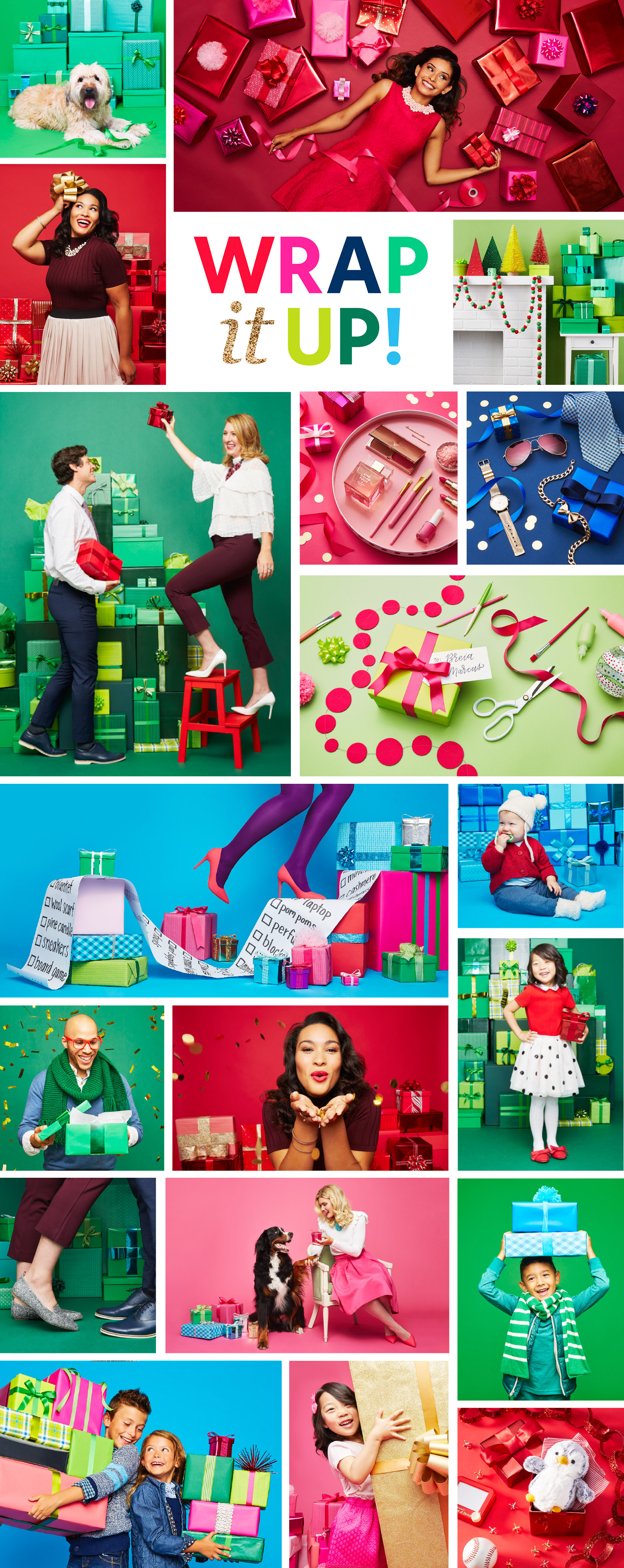
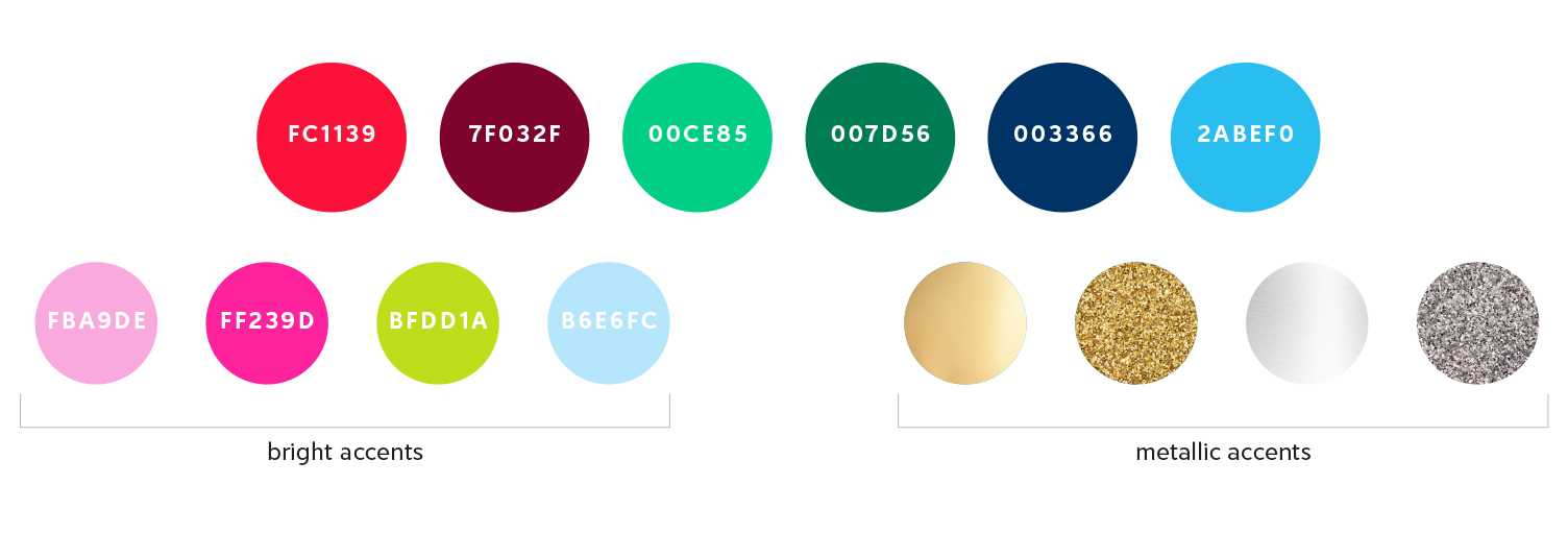
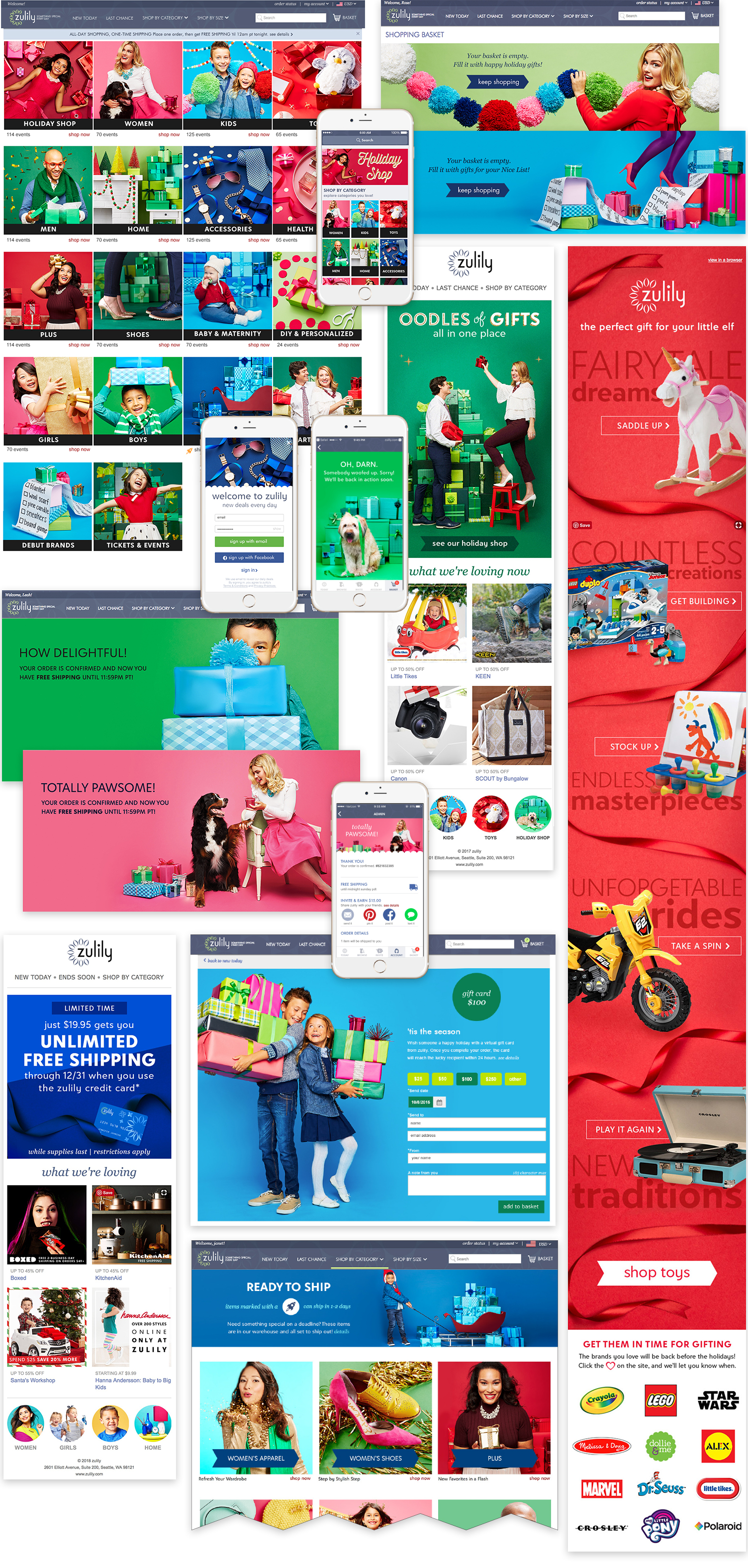
The concept, Wrap It Up, celebrates the magic of the season and the joy of gift giving. The colors are rich and saturated. The photography is sophisticated, but still whimsical. In order to create an impactful, consistent presence on the website, I decided a tone-on-tone approach would standout against the hundreds of other one-off images.
PROCESS & DEVELOPMENT
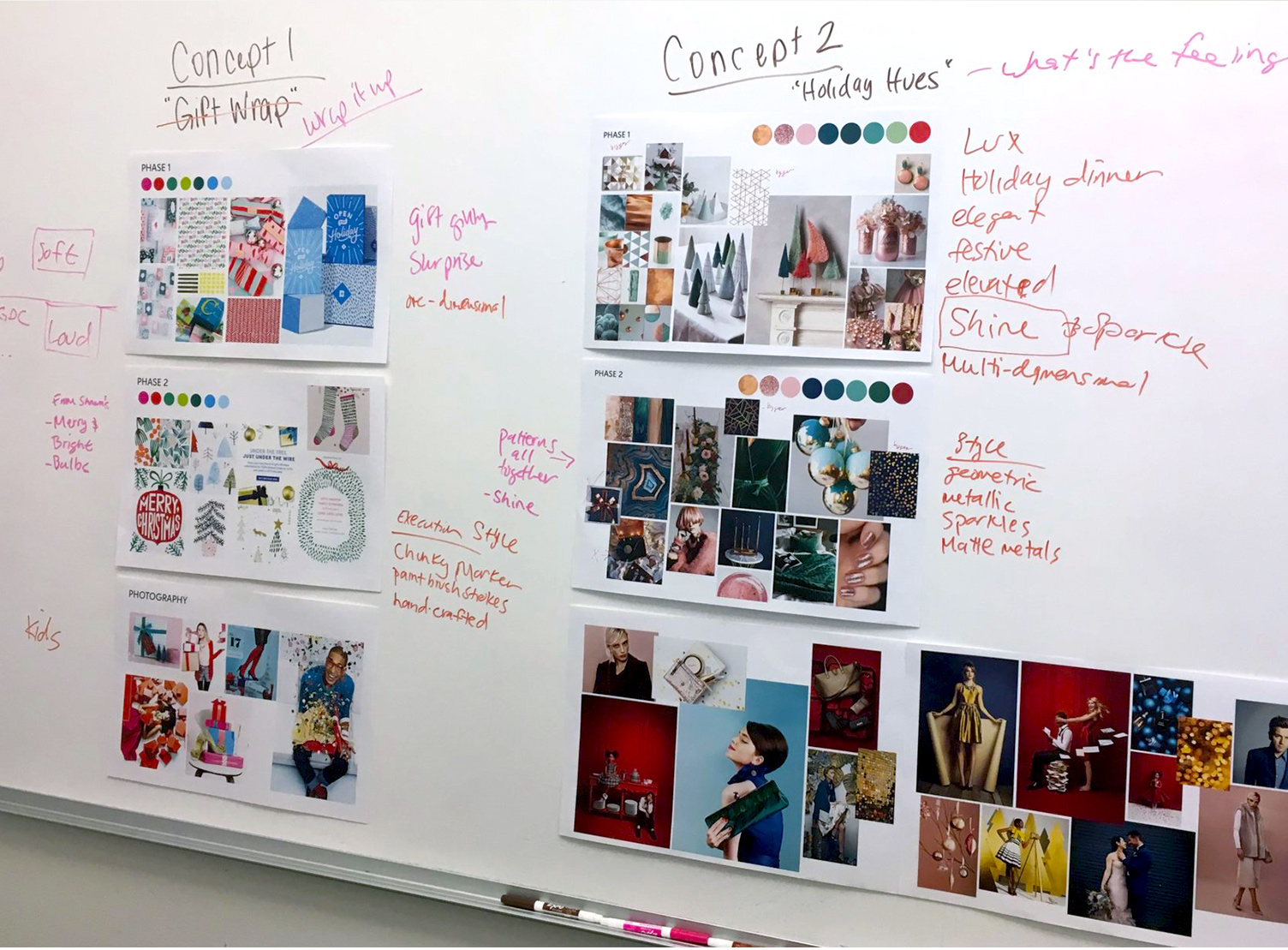
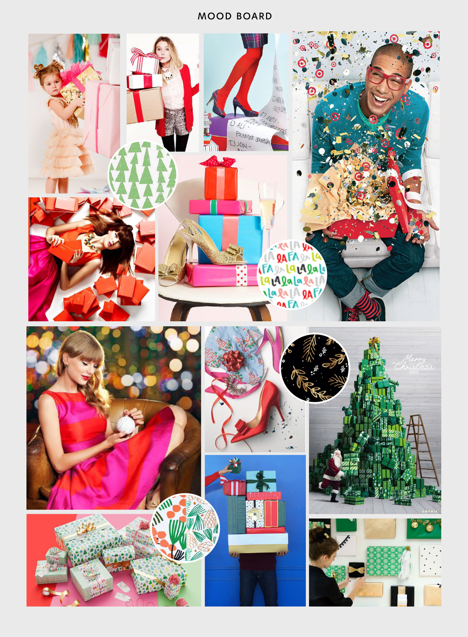
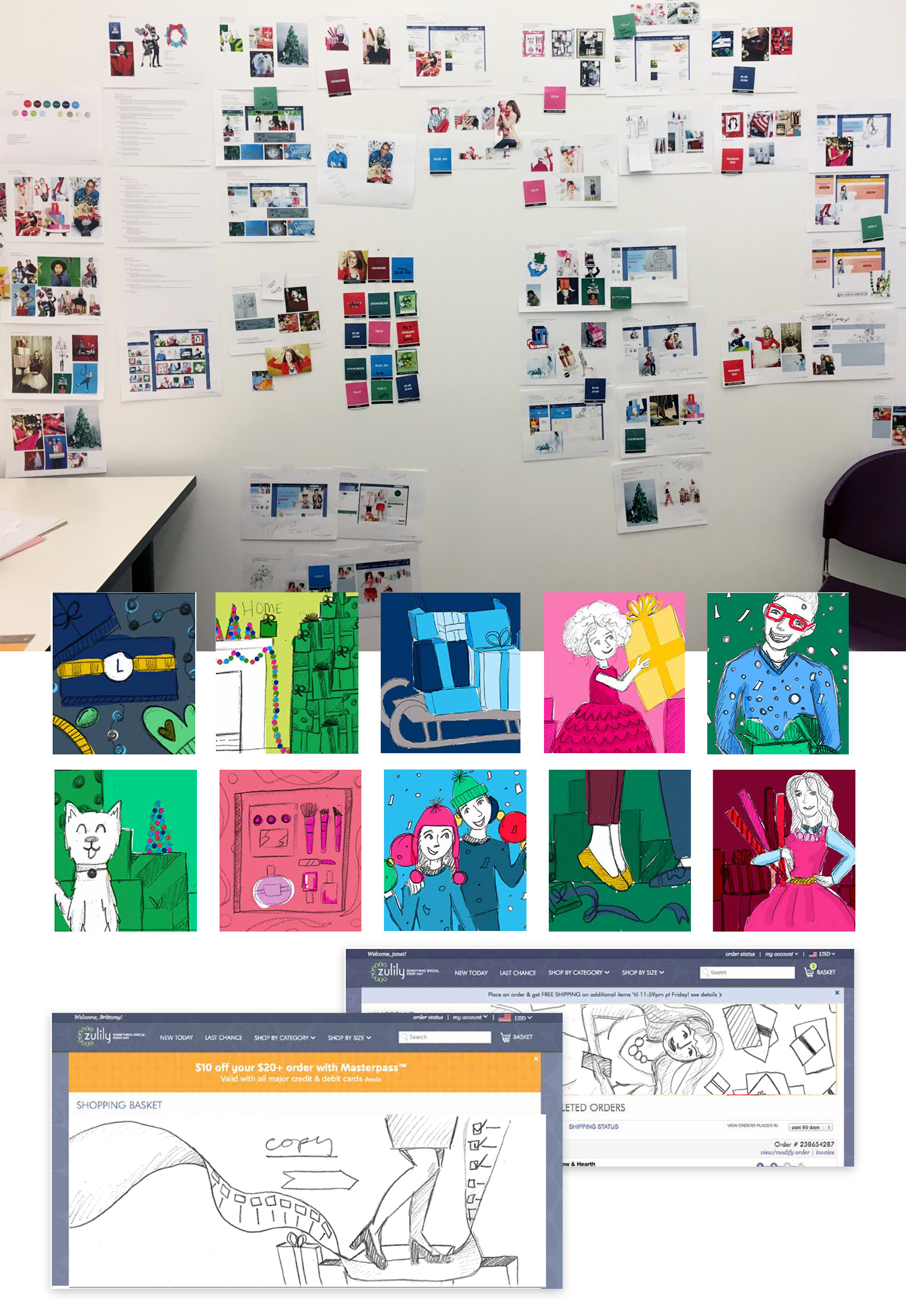
After the initial cross-departmental brainstorm, the design team and I narrowed down ideas into two main themes, and created mood boards to present to the executive team.
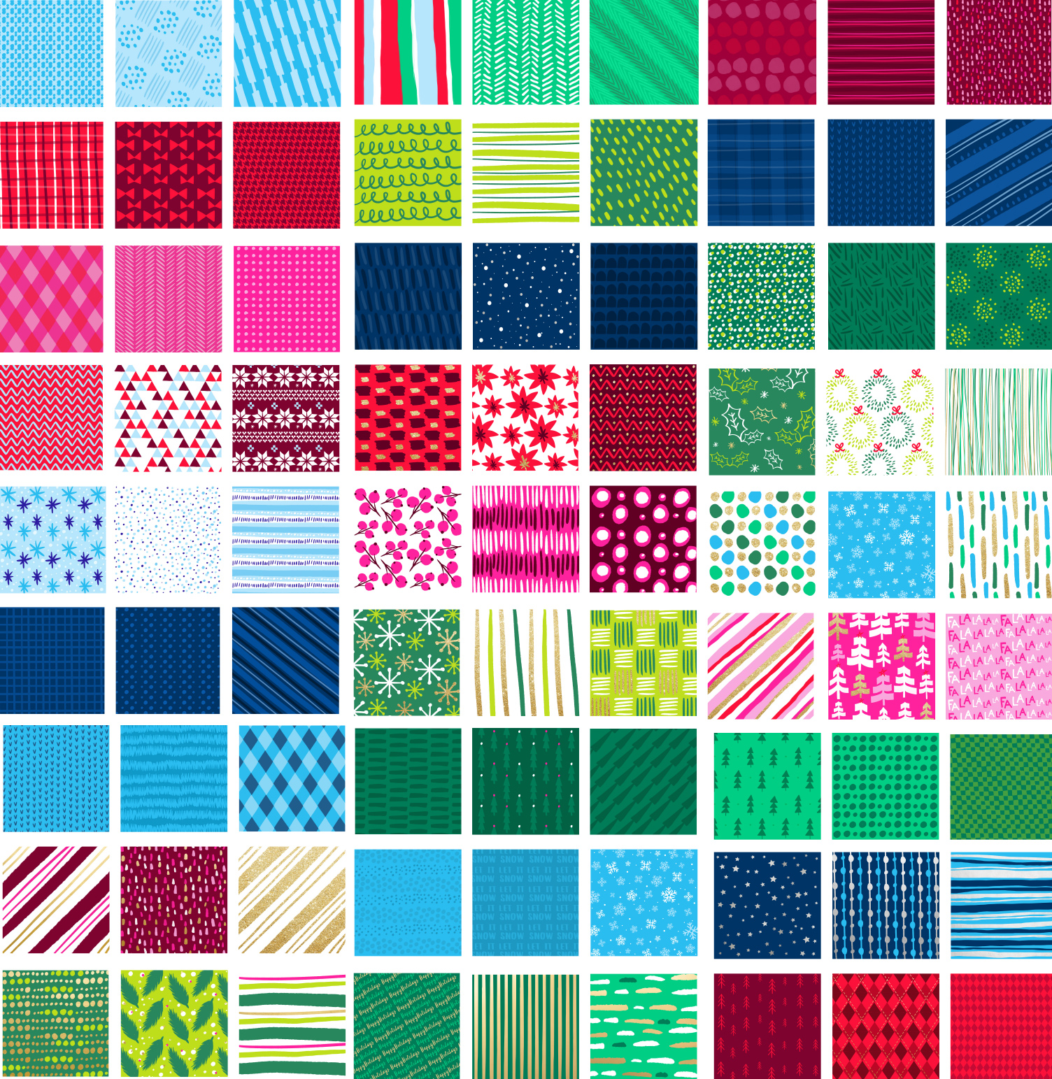
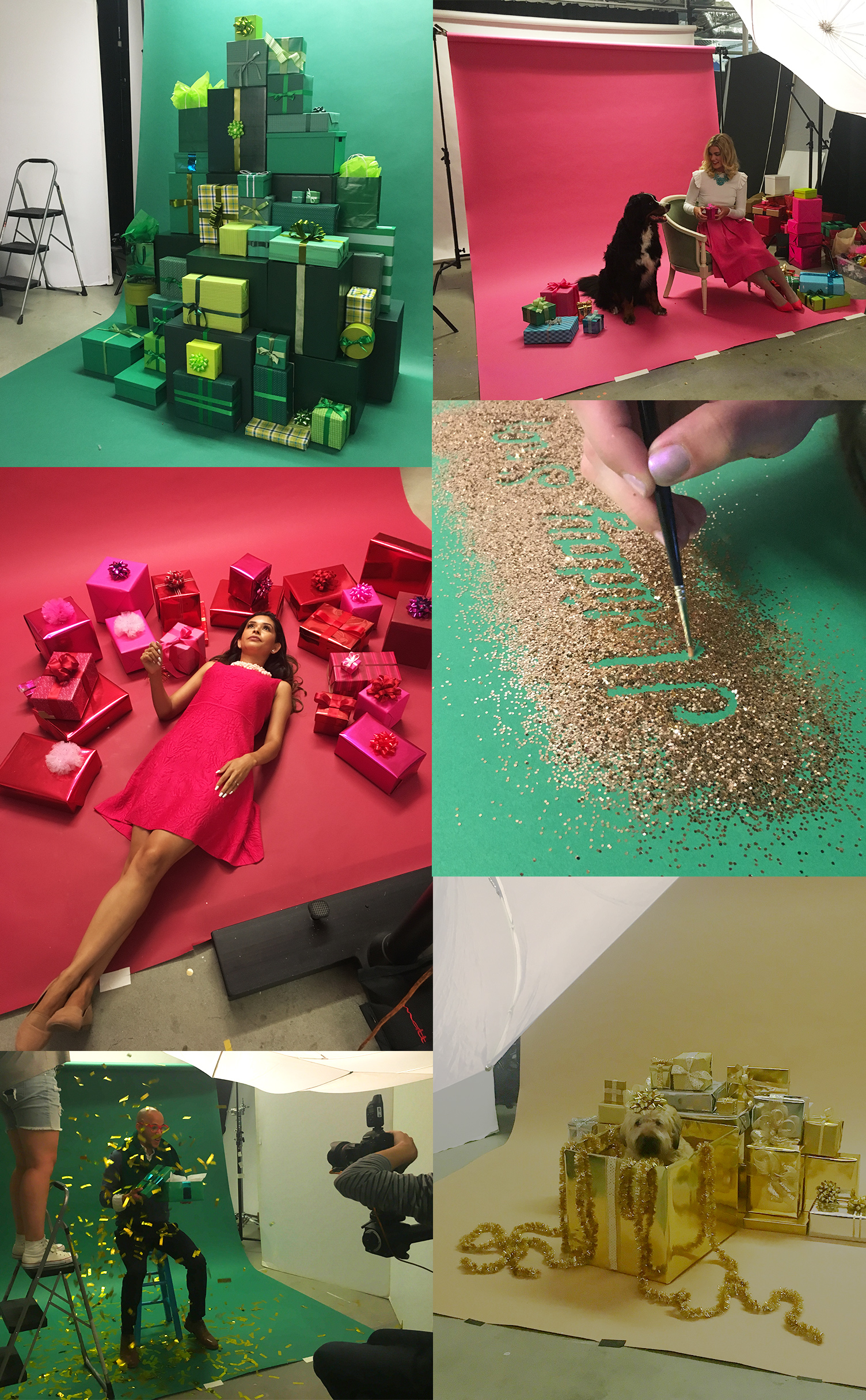
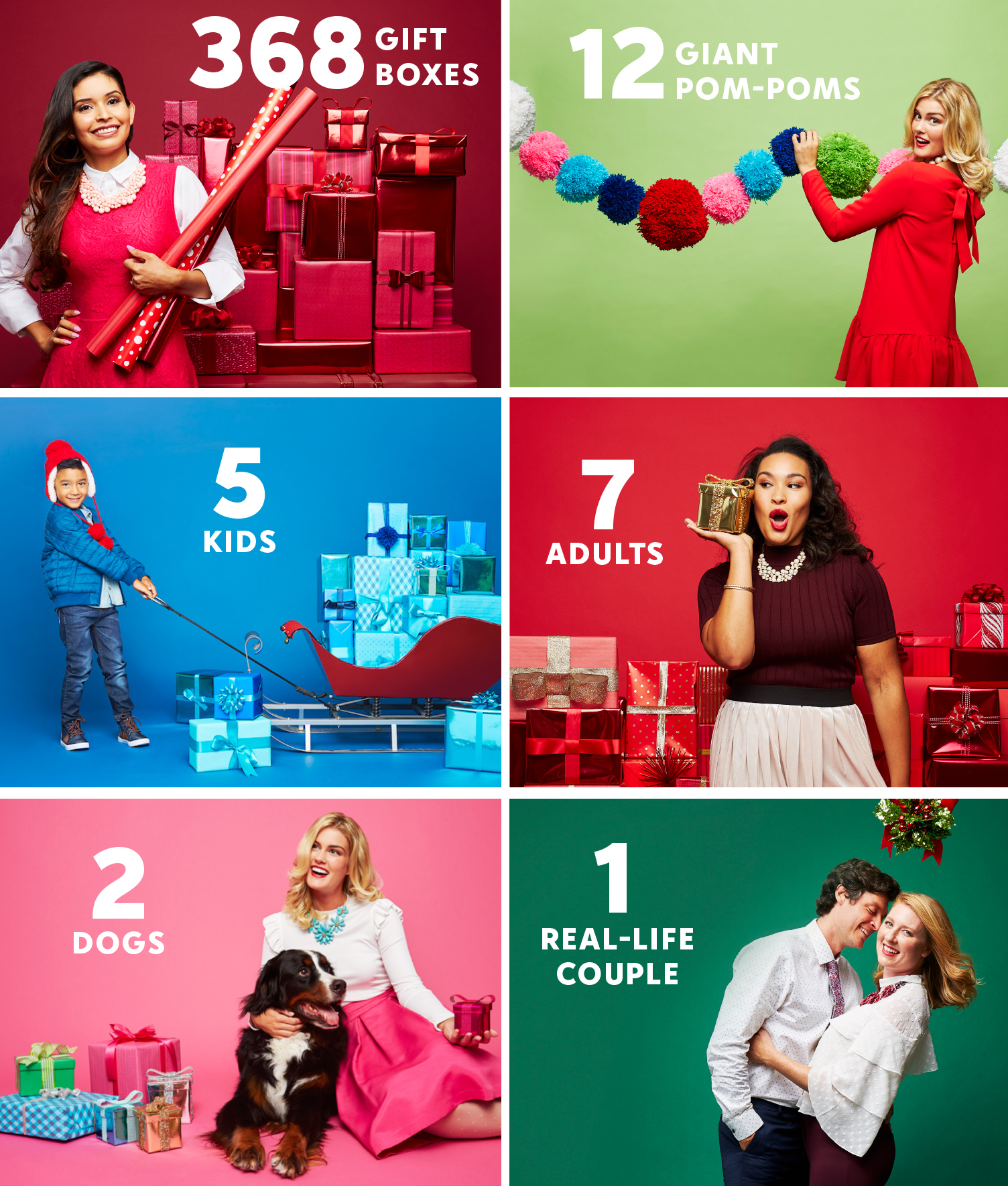
Once we had our concept, Wrap It Up, my team created detailed shot lists and sketches to prepare for the four day, internal photo shoot. Dozens of wrapping paper patterns were designed to use in the shoot, and in assets on the website.
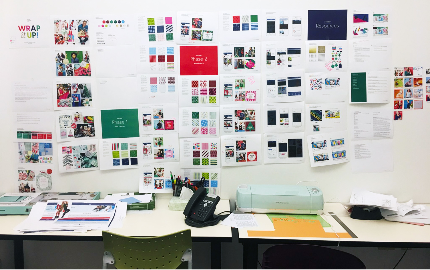
After the photo shoot wrapped, my designers began creating the 50 page style guide to distribute to teams across the company. My team was also responsible for executing hundreds of placements for the desktop and mobile sites, iOS and Android apps, and emails.
In order to keep all teams organized and provide a historical reference for the following year, I created a confluence page to document all assets, placements, live dates, asset sizes, developer needs, linked Jira tickets, and testing plans and results.
The elegant execution and timely theme allowed us to reuse the imagery the following year which saved 800 hours of work.
