

Sur La Table Black Friday Campaign
Role: Creative Direction
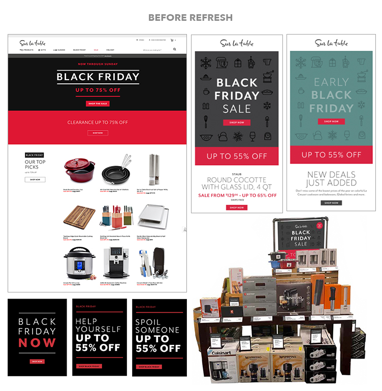
Before my tenure, Sur La Table didn’t have campaign style guides to ensure consistency across channels and guide creative execution. This led to a disjointed customer experience as each channel had a different look and feel.
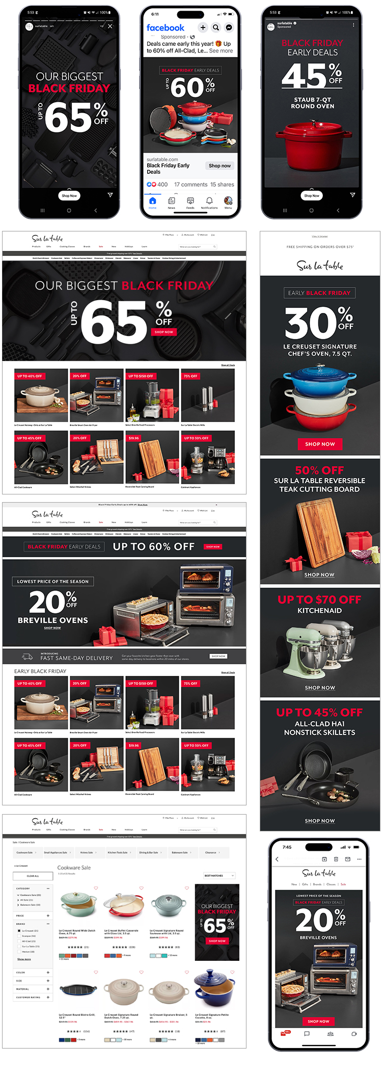
Building on past creative testing, we established campaign requirements that called for a graphic approach, a substantial discount, and black as the primary color.
My team and I developed a concept featuring a flat lay of black products on a black background to convey the wide range of items on sale while maintaining a graphic feel.
Given the multitude of competing messages and promotions at Sur La Table during the holiday season, we needed a way to connect the featured Black Friday products to the overall campaign.
We photographed all the products on a black background to ensure seamless transition from social or email to the website.
To facilitate quick updates throughout the month-long campaign, the team designed flexible asset templates with messaging options and sale extensions. We also proactively prepared for every known contingency, allowing us to be “reactive” only to unforeseen business aspects.
This marked the first cohesive omni-channel campaign for Sur La Table. Visually distinct from competitors, it elevated the brand and delivered a record-setting YoY in total demand, attesting to its remarkable success.
